 |
 |
|
|
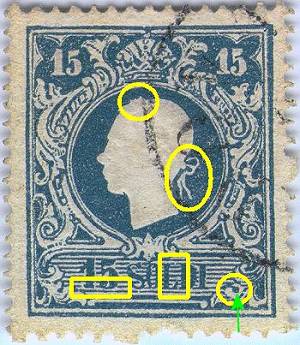
Fig. 1: first type |
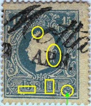
Fig. 2: second type |
15 SOLDI
Also for this stamp its not so complicated to distinguish the two types, as for the previous samples I will show here two pieces, one of the first (Fig. 1) and one of the second type (Fig. 2).
|
|
|
|
|
Fig. 1: first type |
Fig. 2: second type |
The main differences are:
In
the first type the curl of the nape if flat and low, often not so evident
(common characteristic to all the values of the first type). In the
second one the curl is bigger and pointed up (common characteristic
of all the values of the second type). |
In
the first type the ribbon on the back of the nape is open, similar to
"3" and thin (common characteristic of all the values of the
first type). In the second type it is closed, similar to an "8"
and thicker (common characteristic of all the values of the second type).. |
In
the first type the number "15" is well aligned and do not
touch the line under it; in the second type it is poorly aligned and
it is connected to the line under it. |
In
the first type the lines in the background of the value label touch
almost always the letters (for instance: between the "L" and
the "D" of "SOLDI"); in the second type this does
not happen. The entire lower label is anyway quite different between
the two types. |
In
the first type the lower right ornament creates an evident color dot;
in the second one this dot is connected to the right ornament. |
It should be outlined that there are other small details that differentiate the two stamps but they are often very difficult to see (any suggestion? Check again the King profile...). I send you to the reading of specialist material for further analysis.
Catalogued color shades (as per Sassone both the 1st as the 2nd type)
Blue (typical color)
Deep blue