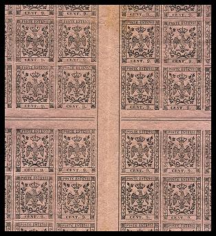
Fig. 1: the center of the sheet of 240 samples
The issue: general introduction
The introduction
of the postage stamps by the Modena Duchy is dated June 1st 1852.
For a long time the postage stamp adoption was strongly pushed by the Austrian
(who had direct influence on the Duchy activities) to align the collection system
with the Austrian one.
After several mixed events, implementation delays, contacts with Vienna and
several doubts, finally the first issue of the postage stamps (called "Bollini"
or small tax pieces of paper) was a reality. With regard to the drawing of the
stamps I repeat here in its complete words how it has been defined by Emilio
Diena "It measures 18.5x21.5mm. The Estensi Eagle with closed wings,
with a royal crown on top and contained in two laurel branches tied at the bottom
with a ribbon, is inserted in a rectangle with lateral ornaments and on top
the label "Poste Estensi" in long capital letters. At the bottom a
space was left between two small ornaments in the corners, where typographic
small capital characters with the indication of the value were supposed to be
inserted; these were kept in place by a line below them that completed the rectangle."
How to explain it in better way? This subject was chosen despite the Vienna
recommendations to find a subject less easy to be forged. At the beginning the
intention was to have the stamps implementation made in Vienna, later on, always
due to missing answers and problems of various nature, the decision was taken
to print in Modena the stamps after having contacted the Tuscany Administration
to gather details and clarifications of the printing methodology.
The engraving of the drawing was done by Tommaso Rinaldi and the minting die
and the matrixes (same for all value with the insertion of the plug with value
in mobile characters) were done by the goldsmith company Rocca, Rinaldi &
Algeri di Modena for the total of Italian L. 850, ("L'importo totale
di Italiane L. 850, Tariffali L. 782"). The printing was made by the
Typographic Office of the Modena Finance Department with a result not really
exciting. A lot of small defects can be found systematically in the typographic
black printing, defects that allow for the identification of the location of
the stamp inside the composition.
At the beginning two compositions of 260 pieces were prepared; immediately reduced
before the issuing to 240 pieces in four groups of 60 (6 rows of 10 pieces).
Between each stamp there was a dividing trait both horizontal (interrupted)
and vertical (continuous). Each group of 60 was separated by an inter-space
of 1 cm, with the horizontal one (looking at the sheet) having a double typographic
line in the middle and the vertical one having a continuous line at the border
of the stamp (Fig. 1).
Fig. 1:
the center of the sheet of 240 samples
In one of the two compositions the values were followed by a dot; this composition
was used to print only some of the values. Here is the summary of the issued
values:
|
5 centesimi
|
Green
|
with and
without the dot
|
|
5 centesimi
|
Olive green
|
with the
dot
|
|
10 centesimi
|
Pink
|
with and
without the dot
|
|
15 centesimi
|
Yellow
|
without
the dot
|
|
25 centesimi
|
Chamois
|
without
the dot
|
|
40 centesimi
|
Pale-blue
|
without
the dot
|
|
40 centesimi
|
Blue
|
with and
without the dot
|
|
1 Lira
|
White
|
with the
dot
|
The paper used was a machine
made paper, colored, of variable thickness, but usually somehow thin, without
watermark. It has been bought in several lots and for this reason it is not
uniform both in color as well as in thickness and with some characteristic
color shades. For the1 Lira value I delay this discussion to the specific
stamp note because there are differences with respect to the other stamps.
Large is the number of errors of the graphic composition, errors that appeared
during the production of the stamps; the origins of the errors in the plugs
with values were a wrong positioning of the characters, of the dots, missing
characters and so on. A list can be seen in the "Going deep".
I leave anyway to the reading of a good catalogue the pleasure of further
going in details on the subject. (be careful on some varieties... not really
originals or due to poor printing more than composition mistakes!) Other interesting
varieties are the stereotype defects, that I was before mentioning, some times
very noticeable, as well as to some double printing. In some case, rather
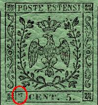
rare case, in the lower label is visible the mark of a typographic space (Fig.
2-3).
 |
 |
|
Fig.
2-3:
: two marks of typographic spaces
|
|
To be mentioned is the presence
of a 25 centesimi value in green color: on the origin of this piece there
are several diverging opinions: somebody believes that it's a printing trial,
somebody else that is a true color mistake (it is represented in the note
of the 25 centesimi value).
This issue was valid up to October 15th.
The volume printed and the remainders (total of the pieces with and without
the dots) are known; they are:
|
Value
|
Quantity
|
Remainders
|
|
5 centesimi
(*)
|
1.932.720
|
700.651
|
|
10 centesimi
|
526.080
|
106.615
|
|
15 centesimi
|
838.080
|
145.902
|
|
25 centesimi
|
998.160
|
495.276
|
|
40
cent. blue
|
501.600
|
254.503
|
|
40
cent. pale-blue
|
17.280
|
372
|
|
1 Lira
|
48.000
|
41.710
|