5 CENTESIMI
As
stated in the general introduction I will limit myself to list and represent
(when I have available the images) only the basic color families, leaving
out all the infinite catalogues shades that I list a at the end of the page
just for knowledge and completeness (click here to go to this section now). I adopted the scheme used by most catalogues to
divide the shades on the basis of the year of issue.
In the "Going deep" section is explaned how to distinguish
the compositions used during the different printing runs.
We must underline that not all the authors are in agreement to consider the
4th composition a real new composition, but simply a variation of the third
one.... and other authors think that there are five compositions.....
ATTENTION: the stamps here presented do have just
an INDICATIVE value in relationship to the color shades: any system composed
by scanner + monitor + video will give back colors even quite different from
the ones I have chosen. For this reason the scans in this page CANNOT be used
as absolute reference but only as approximate indication of the shades.
-
- - - - - - - - -
We can group schematically the 10 cents shades as follows:
(NOTE: some color shades are present in different years, printed with different
printing runs)
| Shade | Used
from |
Composition |
Image |
| Green yellow | July
1855 |
1st |
-
- - |
| Emerald green | July
1855 |
1st |
|
| Pea green | August
1855 |
1st |
-
- - |
| Myrtle green | February
1857 |
1st |
|
| Dark green | February
1857 |
1st |
|
| Yellow green | July
1857 |
1st |
|
| Brilliant yellow green | March
1859 |
2nd |
|
| Yellow green | August
1858 |
3rd |
|
| Yellow green (def. printing) | June
1859 |
3rd |
|
| Olive green | October
1859 |
3rd |
|
| Olive green | March
1861 |
4th |
|
| Dark green | February
1862 |
4th |
|
| Yellowish/olivaceus green | March
1862 |
4th |
|
| Green | July
1862 |
4th |
|
| Bright/deep green | January
1863 |
4th |
 |
 |
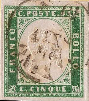
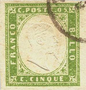
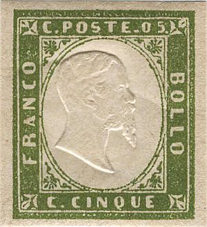
| Fig. 1: emerald green shade, 1st comp. | Fig. 2: deep myrtle green shade, 1st comp. |
| (Back to the color-table) | |
 |
 |
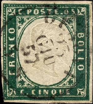
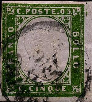
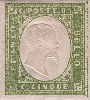
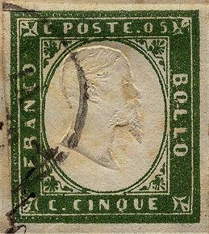
| Fig. 3: dark green shade, 1st comp. | Fig. 4: bright yellow green shade, 1st comp |
| (Back to the color-table) | |
 |
 |
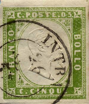
| Fig.
5: brilliant yellow green shade, 2nd comp. (it is quite impossible to show this peculiar shade that is clearly visible with radiant light) |
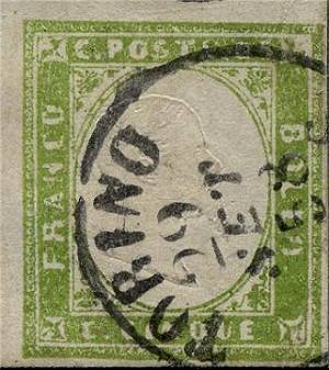
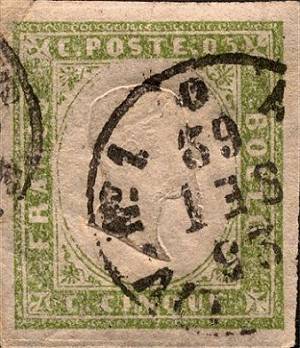
Fig. 6: yellow green shade, 3rd comp |
| (Back to the color-table) | |
 |
 |
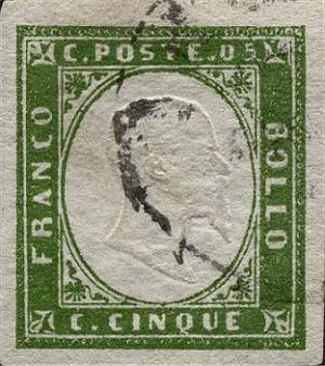
| Fig. 7: yellow green shade (def. printing), 3rd comp. | Fig. 8: olive green shade, 3rd comp. |
| (Back to the color-table) | |
 |
 |
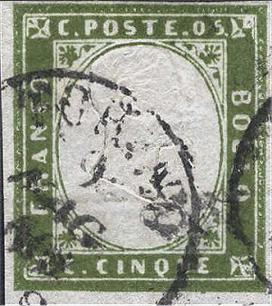
| Fig. 9: olive green shade, 4th comp. | Fig. 10: dark green shade, 4th comp. |
| (Back to the color-table) | |
 |
 |
| Fig. 11: yellowish green shade, 4th comp. | Fig. 12: green shade, 4th comp. |
| (Back to the color-table) | |
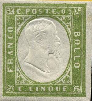
Fig. 13: bright green shade, 4th comp.
(Back
to the color-table)