10
CENTESIMI
As stated in the general introduction I will limit myself to list and represent
(when I have available the images) only the basic color families, leaving
out all the infinite catalogues shades that I list a at the end of the page
just for knowledge and completeness (click here to go to this section now). I adopted the scheme used by most catalogues to
divide the shades on the basis of the year of issue.
In the "Going deep" section is explaned how to distinguish
the compositions used during the different printing runs.
ATTENTION: the
stamps here presented do have just an INDICATIVE value in relationship to
the color shades: any system composed by scanner + monitor + video will give
back colors even quite different from the ones I have chosen. For this reason
the scans in this page CANNOT be used as absolute reference but only as approximate
indication of the shades.
-
- - - - - - - - -
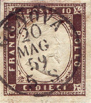
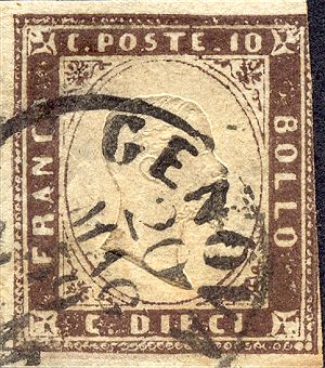
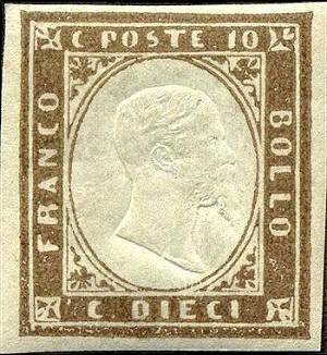
We can group schematically the 10 cents shades as follows:
(NOTE: some color shades are present in different years, printed with different
printing runs)
| Shade | Used
from |
Composition |
Image |
| Umber | January
1858 |
1st |
|
| Purple brown | January
1859 |
1st |
|
| Violet brown | March
1859 |
1st |
|
| Yellowish brown | June
1859 |
1st |
|
| Grays/cuttlefish brown | July
1859 |
1st |
|
| Gray/black brown | October
1859 |
1st |
|
| Chocolate brown | December
1859 |
1st |
|
| Olive gray/gray olive | 1860/1861 |
1st |
|
| Brown/pale brown | January
1861 |
2nd |
|
| Olive brown | January
1861 |
2nd |
|
| Chocolate brown | July
1861 |
1st |
|
| Chocolate brown | October
1861 |
2nd |
|
| Red/bistre brown | March
1862 |
2nd |
|
| Olive bistre | June
1862 |
2nd |
|
| Olive yellow | June
1862 |
2nd |
-
- - |
| Brown/red orange | July
1862 |
2nd |
|
| Yellow/orange ochre | September
1862 |
2nd |
|
| Bistre | January
1863 |
2nd |
 |
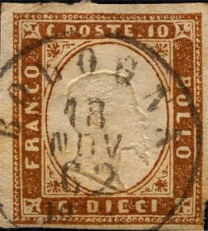
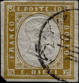
 |
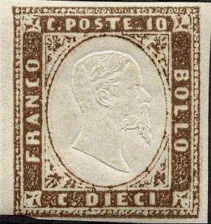
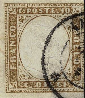
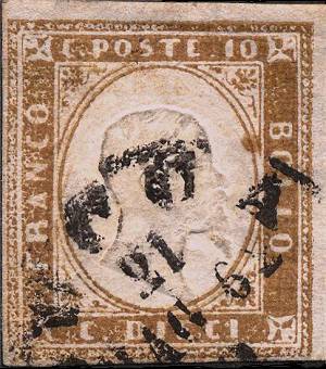
| Fig. 1: umber shade, 1st comp. (defective printing is typical of this shade) |
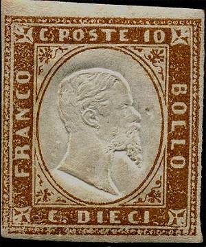
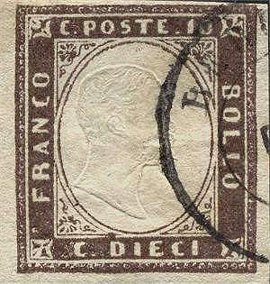
Fig. 2: purple brown shade, 1st comp. |
| (Back to the color-table) | |
 |
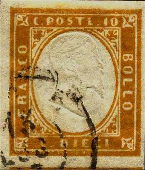
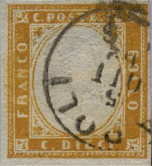
 |
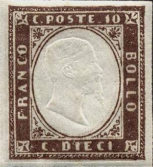
| Fig. 3: violet brown shade, 1st comp. | Fig. 4: yellowish brown shade, 1st comp. |
| (Back to the color-table) | |
 |
 |
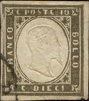
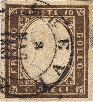
| Fig. 5: brown-cuttlefish gray shade, 1st comp. | Fig. 6: brown black shade, 1st comp. |
| (Back to the color-table) |
|
 |
 |
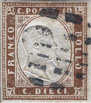
| Fig. 7: deep brown chocolate shade, 1st comp. | Fig. 8: olive gray shade, 1st comp. |
| (Back to the color-table) | |
 |
 |
| Fig. 9: brown shade, 2nd comp. | Fig. 10: olive brown-gray shade, 2nd comp |
| (Back to the color-table) | |
 |
 |
| Fig. 11: dark chocolate-brown shade, 1st comp. | Fig. 12: bright chocolate-brown shade, 2nd comp. |
| (Back to the color-table) | |
 |
 |
| Fig. 13: reddish bistre brown shade, 2nd comp. | Fig. 14: olive bistre shade, 2nd comp. |
| (Back to the color-table) | |
 |
 |
| Fig. 15: reddish orange shade, 2nd comp. | Fig. 16: ochre orange shade, 2nd comp. |
| (Back to the color-table) | |
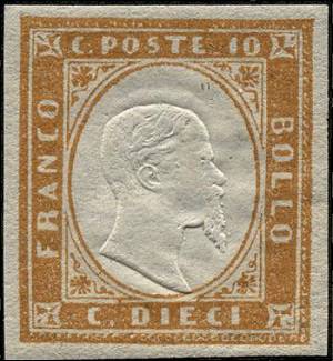
Fig. 17: bistre shade, 2nd comp.
(Back to the color-table)