20 CENTESIMI
As stated in the general introduction I will limit myself to list and represent (when I have available the images) only the basic color families, leaving out all the infinite catalogues shades that I list a at the end of the page just for knowledge and completeness (click here to go to this section now). I adopted the scheme used by most catalogues to divide the shades on the basis of the year of issue. In the "Going deep" section is explaned how to distinguish the compositions used during the different printing runs.
This piece was in use up to December 31th 1862 (but tolerate also after this date) due to the reduction from 20 to 15 cents. of the first-rate letters.
ATTENTION: the stamps here presented do have just an INDICATIVE value in relationship to the color shades: any system composed by scanner + monitor + video will give back colors even quite different from the ones I have chosen. For this reason the scans in this page CANNOT be used as absolute reference but only as approximate indication of the shades.
-
- - - - - - - - -
We can group schematically the 20 cents shades as follows:
(NOTE: some color shades are present in different years, printed with different
printing runs)
| Shade | Used
from |
Composition |
Image |
| Cobal | June
1855 |
1st |
|
| Sky blue | July
1855 |
1st |
|
| Gray blue | January
1857 |
1st |
|
| Ultramarine blue | February
1857 |
1st |
|
| Indigo | April
1857 |
1st |
|
| Ultramarine cobalt | August
1857 |
1st |
|
| Deep blue | March 1859 |
1st |
|
| Gray blue/cobalt | April
1860 |
1st |
|
| Very deep blue | November
1860 |
1st |
|
| Sky blue | January
1861 |
2nd |
|
| Cobalt (many shades) | January
1861 |
2nd |
|
| Ultramarine blue | 1861 |
2nd |
|
| Indigo | August
1861 |
2nd |
|
| Metallic indigo | September
1861 |
2nd |
 |
 |
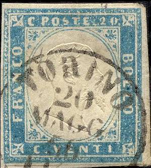
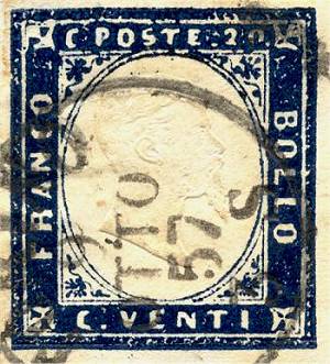
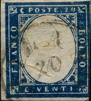
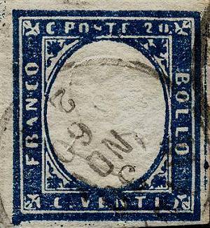
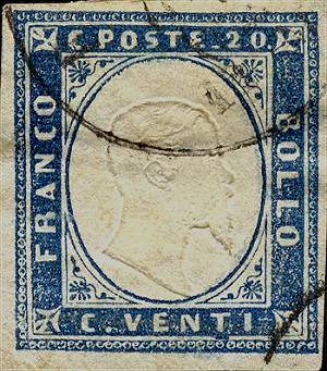
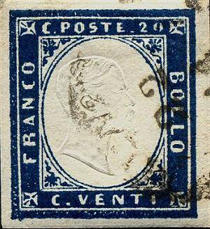
| Fig. 1: bright cobalt shade, 1st comp. | Fig. 2: sky blue shade, 1st comp. |
| (Back to the color-table) | |
 |
 |
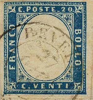
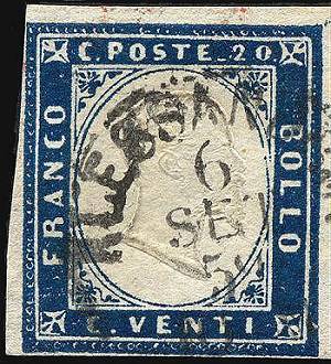
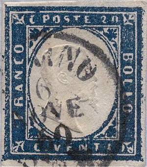
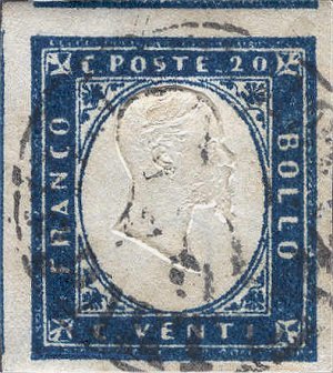
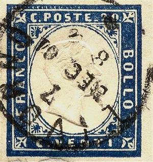
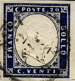
| Fig. 3: graysh blue shade, 1st comp. | Fig. 4: deep ultramarine blue shade, 1st comp. |
| (Back to the color-table) | |
 |
 |
| Fig. 5: indigo shade, 1st comp. | Fig. 6: ultramarine cobalt shade, 1st comp. |
| (Back to the color-table) |
 |
 |
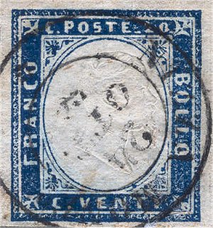
| Fig. 7: deep blue shade, 1st comp. | Fig. 8: graysh blue shade, 1st comp. |
| (Back to the color-table) | |
 |
 |
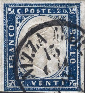
| Fig. 9: very dark blue shade, 1st comp. | Fig. 10: sky blue, 2nd comp. |
| (Back to the color-table) | |
 |
 |
| Fig. 11: cobalt shade, 2nd comp. | Fig. 12: ultramarine blue shade, 2nd comp. |
| (Back to the color-table) | |
 |
 |
| Fig. 13: indigo shade, 2nd comp. | Fig. 14: violet metallic indigo (this peculiarity is visible observing the piece with radial light) |
| (Back to the color-table) | |