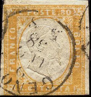
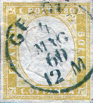
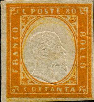
80 CENTESIMI
As stated in the general introduction
I will limit myself to list and represent (when I have available the images)
only the basic color families, leaving out all the infinite catalogues shades
that I list a at the end of the page just for knowledge and completeness (click
here to go to this section now). I adopted the scheme used by most
catalogues to divide the shades on the basis of the year of issue.
This value was printed with only one plate.
ATTENTION: the
stamps here presented do have just an INDICATIVE value in relationship to
the color shades: any system composed by scanner + monitor + video will give
back colors even quite different from the ones I have chosen. For this reason
the scans in this page CANNOT be used as absolute reference but only as approximate
indication of the shades.
-
- - - - - - - - -
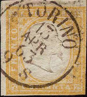
We can group schematically the 80 cents shades as follows:
(NOTE: some color shades are present in different years, printed with different
printing runs)
| Shade | Used
from |
Image |
| Bistre orange | January
1858 |
|
| Ochre orange | February
1858 |
|
| Ochre/olive yellow | January
1859 |
|
| Orange yellow | 1860
-1861 |
|
| Deep orange | Aprile
1861 |
|
| Yellow | Marzo 1862 |
 |
 |
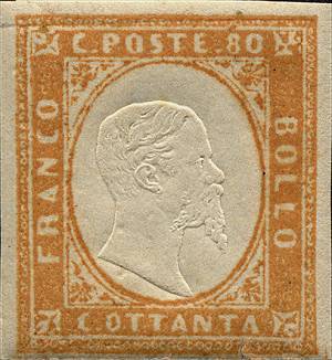
| Fig. 1: dark bistre orange shade | Fig. 2: ochre orange shade |
| (Back to the color-table) | |
Fig.
3: bright olivish yellow shade |
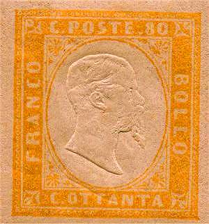
Fig.
4: orange yellow shade |
 |
 |
| Fig. 5: deep orange shade | Fig. 6: yellow shade |
| (Back to the color-table) | |