|
5
centesimi
|
Black
|
| 20 centesimi |
Blue
|
|
40 centesimi
|
Pink
|
In origin also a value
of 80 centesimi was planned, but it was not done.
The subject is the Vittorio Emanuele II effigy, in profile, facing right,
obtained from the circulating gold coins, inserted in a colored oval. All
around there is a double rectangular frame with the labels (from left) "FRANCO",
"C. POSTE 0.5" "BOLLO", "C. CINQUE". Obviously
the labels "0.5" and "CINQUE" change depending on the
values. Around that there is a frame made by small pearls. In the curved corners
formed by the oval with the first frame and in the 4 corners of the double
rectangular frame, there are small decoration ornaments.
The issue was supposed to be printed in typography, but due to the hurry to
do the work the assignment of the job went to a lithographer from Turin Francesco
Matraire, for the payment of "5 Lire each 1,000 delivered stamps and
2.50 Lire for each steel cancellation tool". He was the designer,
engraver and producer of the issue. He did the drawings in lithography on
stone because he did not have any typographic machines. The drawing war engraved
very skillfully, and interesting, in independent way for the three values,
so they differ in several small details. The printing was made in sheets of
50 pieces, divided in 2 groups of 25 (5x5) placed side by side and separated
by a group inter-space of about 5.5 millimeters. It is known the existence
of some couple with inter-spacing; it's a great rarity.
And let's discuss the headaches.
The used printing system was not constant; at the beginning Matraire duplicated
the original matrix as many times as the stamps (therefore 25 duplications
for each of the two groups). This originated sharp and well-detailed printings,
typical of the very first printing runs. Later on, to go faster, also because
the demand of stamps was probably growing, he prepared a composition of 25
pieces without starting from the original engraving. From this new matrix
that he kept as main stone he obtained others for the various printing of
50 and 100 parts each sheet (2 or 4 groups of 25), printing the entire block
in one step (and therefore 2 or 4 steps for each sheet). These subsequent
duplication operation were not identical and constant in time, to the point
that some signs, some of them really minor, allow for their identification
Besides that the quality of the plates so obtained was clearly worse in comparison
with the first printing run. There are also some revisions made directly on
the stones that sometimes make the situation even worse. The printing stones
wear out forced sometimes to substitute completely some element. In the general
cards of the various stamps there are no details on the printing runs classification
and on the duplications, often not even mentioned by catalogues due to the
subject complexity: I will limit myself on the description of the typical
stamps. For the curious ones the subject will be discussed more extensively
in the section "Going Deep". To be complete in my exposition
I have to report that a recent study by F. Lucini maintains that the qualitative
difference between the different printings isn't due to the two different
system used but only to the fact that, at the beginning, the paper ready to
be printed was moistened: with this system the colour fixed itself better
on the paper with an aesthetically better result; afterwards this system was
given up to "speed" the production. Unfortunately I haven't
the technical competence to form an opinion about this problem.....
Matraire
took care of inserting two small secret signs in his work, to distinguish
them from eventual forgeries. They are two small pearls of the frame that
are completely white: they are above "TE" of "POSTE" and
the seventh from the bottom on the right side (Fig. 1). It happens
frequently that, due to the inking these pearls look similar to the others.
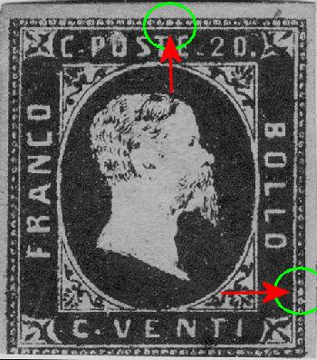
Fig. 1: the two pearls always white, secret sign
of the engraver
The stamps are printed on machine made paper, of average thickness, of very
good implementation and enough constants in time, without watermark. The color
shades that we find are variable.
The quantity printed is unknown but from the very detailed Rattone manual
we can find the parts sold, as follows (data are absolutely indicative):
|
5 centesimi
|
<250.000
|
| 20 centesimi | <900.000 |
|
40 centesimi
|
<90.000
|
There are neither particular
varieties nor reprints: the ones circulating on the market are forgeries.
They were valid up to September 30th 1853.