|
5
centesimi
|
Green
|
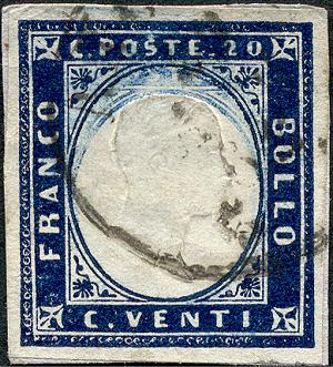
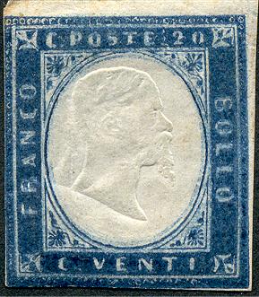
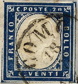
| 20 centesimi |
Blue
|
|
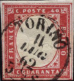
40 centesimi
|
Red
|
It substituted the
previous 3rd issue as this last was getting sold out. As already happened
for other sets there is no official Decree that states his birth (a Decree
will be issued later on when the other values of the set will be issued).
It's possible that once again the difficulties to distinguish the values,
especially the 5 and 20 centesimi, and the labels of the stamps so unreadable
of the previous issue were the reason of this new "delivery"
of stamps. In fact for the Postal administration this issue was only a new
"delivery" with some variations in comparison with the previous
ones!
The drawing is more or less the same of all the previous issues, therefore
I will not describe it once again here.
Later on new cuts were added to the set due to the new fees and precisely:
|
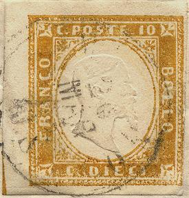
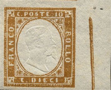
10 centesimi
|
Brown
|
From
January 1st 1858
|
| 80 centesimi | Orange | From January 1st 1858 |
|
3 Lire
|
Copper
|
From
January 1st 1861
|
The issue is printed
in typography, always by Matraire, in sheets of 50 pieces (10 rows of 5),
on machine made paper, without watermark. In relationship with the typographic
printing, some stamps present instead some clear lithographic characteristics:
debates and studies were raised about that. I will just say that the postage
stamps are printed in typography (this is the case almost always) but perhaps
there were some deliveries where, may be for Matraire "bad habit"
(he was indeed a lithographer) or for the need to act rapidly, the typographic
printing system was at least mixed with the lithographic one during the production.
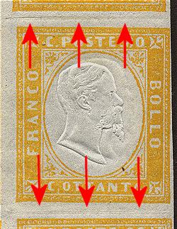
Let's examine now the main stamp characteristics.
The dimensions were about 19x21 millimeters. The printing table, as said,
was composed by 50 stamps (only later on, may be to make the job quicker a
printing system of 100 stamps was used, putting side by side two systems of
50 stamps. Because the various stereotypes were obtained by duplication from
the original matrix, each stamp differs from the other by very small details
that can help in the reconstruction of the table. To these we have to add
the various defects created during the very numerous printing runs and compositions:
smoothing of the frames, small bumps, scratches etc. that we can find constant
for various deliveries. The printing table was surrounded by a thin blade
frame, a metallic sheet inserted all around the composition to keep it more
stable: according other people it was just an ornament for cosmetic reasons;
hypothesis, to my opinion, a bit strange if we think that as printed the sheet
borders were cut and thrown away. The blade is placed at different distances
depending on the value and it is not present in the 80 centesimi and 3 Lire
values. Because, as said, the borders were cut before being distributed (operation
called "trimming" - "tosatura" in italian
language), that line appear only in very rare cases in the stamps (Fig.
1), while it can be found in the essays and printing waste (Fig. 1a).
To be noticed also that the single stereotypes often, once fastened on a wood
table, (even if some thinks impossible the use of this material...), were
not so well aligned or moved and therefore we can find samples tilted, even
considerably, in comparison with the near stamps (Fig 2).
 |
 |
|
Fig.
1: shhet frame at left
|
Fig.
1a: right sheet frame;
waste of printing with false effigy |
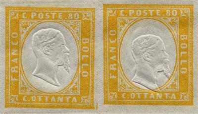
Fig. 2: couple with clear misalignment
Around the external frame of the stamps we can see often some marks similar to lines, Typical the case of the 40 centesimi where in the position 12 of the sheet we can see always this line almost complete (Fig. 3). Rattone, in his fundamental study, makes the hypothesis that they can be also marks left by "small typographic cardboard" inserted to eliminate too large "shifts" that were created in the printing table.
 |
 |
|
Fig.
3: a 20 and a 40 centesimi with the external
blade mark very evident
|
|
Another small characteristic of these stamps is that the ornaments at the 4 oval corners do not have equal distance from the oval itself. In particular, the upper left one is always more distant in comparison with the others (Fig. 4).
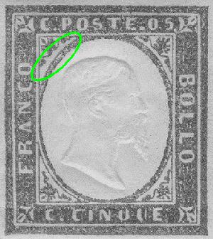
Fig. 4: the upper left ornaments
is always the more distant from the oval
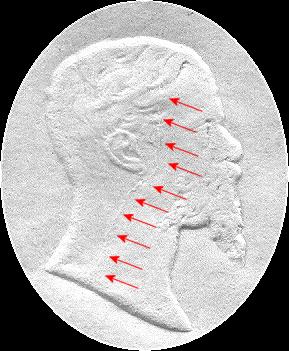
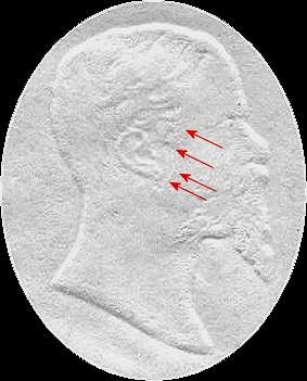
For some values (5,
10 and 20 centesimi) we can also notice some small engraving signs, probably
inserted by design as secret signs to recognize the originals from eventual
forgeries. Here they are in detail.
In the 5 centesimi value the horizontal upper line of the internal upper ornament
is not continuous (Fig. 5).
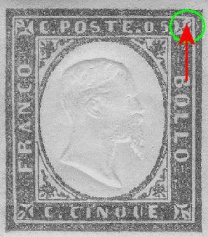
Fig. 5: the secret sign of
the 5 centesimi
In
the 10 centesimi value the letter "T" of "POSTE" is more
evident than the others and also very slightly shifted upside (Fig. 6).
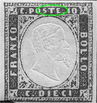
Fig. 6: the secret sign of
the 10 centesimi
In the 20 centesimi value we can notice a very minor notch of the internal frame under last "O" of "BOLLO"; it is not always visible due to the inking (Fig. 7).
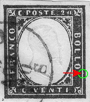
Fig. 7: the secret sign
of the 20 centesimi
The central effigy, work of the skilled Coin House engraver Giuseppe Ferraris,
was embossed in two different ways. At the beginning 50 embossed images were
done simultaneously, kept together on a kind of dry printing matrix: each
effigy was kept in place (welded?) on a metallic base of about 20x22 millimeters,
therefore just a bit larger than the stamp. During the effigy embossing the
various rectangular supporting parts left in quite evident way the marks around
the stamps, in the margins (Fig. 8). According to others authors the
effigy was embossed singularly by hand by means of a tool called "stanhopes":
I find this interpretation strange, because it would have made much longer
the production time.
The tools used to emboss the effigies were not all identical but several very
minimal details (mainly in the ear) make them different; but this is a subject
for super-specialists!
 |
 |
|
Fig.
8: the mark of the rectangle that
sustained the effigy
(The 80 centesimi presents also a very clear double effigy) |
|
With the second system,
used from 1861-62, the effigies were embossed in horizontal couples. This
new approach is paradoxically less efficient of the previous one because was
taking more time: it was put in place originally to produce the Neapolitan
Province stamps but it was adopted also for the Sardinia stamps, despite the
previous system was not yet disappeared definitively. For other authors the
ones that think that originally, as said, were embossed singularly, this system
was making after the job because the effigies were impressed in couples and
not one by one. As you can see the ideas are often in contras...
About this second system we can ask the question: if each row has 5 pieces
how we can emboss the effigies in couples?
Answer: in each row three couples of effigies were embossed, the first time
on the left sheet border (and therefore with no use) and on the first sample,
the second one for the 2nd and 3rd parts, the third one for the 4th and the
5th ones.
In this way the effigies are aligned in couples with the exception of the
first one that is aligned with the one embossed on the border that was discarded
before the stamps utilization (we can find this effigy only on essays, printing
trials and printing waste).
In Fig. 9 I reproduce a strip of 5 (the maximum possible in horizontal
direction) where it's possible to verify perfectly what just said.
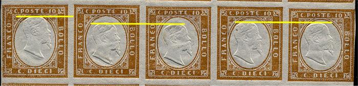
Fig. 9: the alignment in couples of the second system
As I was mentioning
just above this second system was born for the need to prepare the stamps
for the Neapolitan Provinces but it should be noticed how the previous system
was not fully abandoned, especially at the beginning.
This double effigy system, that was probably without any adequate lateral
supports, "released" quite a big pressure on the couple of
tools that with the time and usage cracked down. As for some authors (as per
Damilano) there are in reality steel fusion defects that finally came out
at the surface. In fact, starting 1862, became visible what are called "small
and large crackdown". The small crack is found in 1st, 3rd and 5th
vertical sheet row while the large one in the 2nd and 4th vertical column.
They are not easy to be seen, especially in used samples and in particular
the small crack. I give you here a reproduction (Fig. 10-10a) of these
cracks. The stamps that show these characteristics in evident way are somehow
in demand.
 |
 |
|
Fig.
10: the large crack
|
Fig.
10a: the small crack
|
While we are dealing
with effigies let's talk about multiple embossing, enough common especially
in the last printing runs, when the production was massive and less accurate.
It is not rare to find samples with double effigies (Fig. 8); very
interesting instead are the parts that present the effigies clearly apart
from each other or that present triple embossing. Even parts with two effigies,
one as usual and the second one upside down, do exist: they are indeed rarities.
As we can see from the above images the ear presents a very very small earring:
for some specialist (for instance Diena) it is another secret sign, placed
by design.
In relationship with the paper used, it was of very different types, also
because of the long period during which the set was in use and for the huge
quantities of printed parts; it was always machine made, white or ivory white,
without watermark. It can be found thick, thin, porous, flat and so on. Generally
speaking it went qualitatively worse with the progress of the printing runs.
It has often thickness variable between 4 to 10 hundredths of millimeter.
These stamps had various printing runs and two plates and various compositions
were used during the years (only one for the 40 and 80 centesimi values and
for the 3 Lire). Some details allow for the attribution of one sample to the
various plates/compositions; even if not always in an easy way. In the "Going
Deep" section it is shown how to try to recognize them.
A specific note should
be made for the 3 Lire; this value was aimed to the very high postage rates
that needed a number of stamps quite high. To avoid forgeries particular technical
tricks were adopted. After being printed in reddish brown shade, the stamp
still humid, was covered with metallic powder in gold bronze color that got
mixed together with the color giving the characteristic copper color (that
the Decree of the issue called "gold"). For this value only
the embossing system of the 50 effigies was used (1st type) Even the printing
was not made with 50 pieces one by one side by side but with an unique block
of 50 stamps. It's a stamp quite rare especially if used and on letter.
And let's come to the colors: I have already mentioned how they are hundreds.
The long period of use of this issue, the variety of inks used, and the huge
quantity of parts printed, were the cause of a shade variety that has no equal
in the Italian philately and may be international, for a single issue.
About the shades classification we can debate for weeks. Personally I arrived
to the absurd conclusion (and very personal, let's understand
each other!) that a precise classification of all the shades is impossible
and endless. The same catalogues and manuals call differently identical stamps,
the nuances and the sub-shades, the chromatic shadings, the poor printing
runs, rich runs, antique, and more you have more you can put it, look just
made to get crazy the calmest between the collectors.
What we can say with some good sense is that there are some big basic-color
categories, appeared during the years, clearly different between them, in
the way that even the color often helps to classify the table of origin of
a sample: for instance the emerald green is easily identifiable and is part
of the first printing runs of the 5 centesimi without repeat itself in the
following printing runs. Therefore the union color + composition + paper +
cancellation (if date is clear) allows for the classification of a samples
with relative accuracy. Much more difficult becomes the job when we want to
identify with in correct way the various chromatic shades. Don't you believe
me? Try to take some parts and show them to different philatelic experts.
Do you want to bet that the answers on the shades will not be in perfect agreement?
Jokes on the side (but not completely) in the single values cards I will represent
only big color families, without absolutely going deep in the specialization,
that I would not be capable to deal with correctly and that would bring me
only to make big mess. Also because, never like in this case, two different
monitors could present chromatic nuances in different way making vane all
the efforts of a correct representation and why not even two different people
can see a color not in the same way. Therefore as an example, I will represent
for the 5 centesimi of 1855-56 years the yellow green, pea green and emerald
green shades leaving out all the nuances of light, dark, pale, soft, dull
dark, heavy, bright, dull, milky, muddy, granular, velvety, glossy, etc. that
I will list only for completenes.