Fig. 1: the value plug is often more spaced on the right
The 1st issue - general introduction
The 1st
issue of the Tuscany Grand Duchy goes back to April 1851.
The Tuscany Administration used the Austria experience in the subject and in
fact an executive was sent from Vienna to give suggestions and explanations
(such Giuseppe Hueber).
The chosen subject was the "Etruria Lion with Crown" called
also "Marzocco". The lion, sitting on a kind of small pedestal,
is at the stamp center, facing left, and keeps under the left paw the shield
with the lily. All around there is a double rectangular frame with (from left
to right the label "FRANCOBOLLO", "POSTALE", "TOSCANO".
The chosen subject, the Lion that hanging over the shield, comes from the symbol
of the town of Florence. The famous sculptor Donatello, did an important masterpiece
on this subject, called exactly "Marzocco", that he did at
the beginning of the 1400. Strange enough, today in the popular say in Tuscany,
"Marzocco" is instead the denomination of man foolish, useless
and "simpleton"...
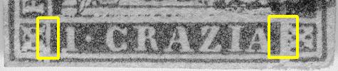
In the lower part of the stamp there is the plug with the label of the value
and on the four corners there are small ornaments of squared form. The original
minting die had the lower plug full. Therefore the corresponding part was taken
off. Operation that left some minimal sign: for instance to the right of the
plug with the value there is usually a bit more space than on the left (Fig.
1). In addition the lower border is interrupted both at the right and at
the left, except in some cases, especially in the first printing runs, where
some times we can find complete in both sides (not common) or only in one (not
frequent) - Fig. 2 -
Fig. 1: the value plug is often more spaced on the
right
|
|
|
|
Open
plug
|
Plug
closed on the left
|
|
|
|
|
Plug
closed on the right
|
Plug
completely closed
|
Fig. 2:
as the value plug can presents itself
The stamp of rectangular shape measures about 18.5x22.5 mm. The original
minting die was made in steel by Giuseppe Niderost, on of the most skilled engravers
of the Granduchy Mint House: the job was completed in short time. The various
stereotypes for the printing were done by Alessandri foundry and the printing
was executed by the "Tipografia Granducale F. Cambiagi e Co." from
Florence, in the rooms of the Postal Department, in Piazza of the Signoria,
with typographic system. Only one printing table was prepared without the indication
of the value that, as said, was inserted case by case with mobile characters.
The sheets comprehended 240 pieces, organized in three groups one on top of
the other of 80 (5 rows of 16 pieces), separated from each other by a very small
inter-space, about 1.5 millimeters. The three groups were separated before being
distributed for their sale and therefore we cannot find couples separated by
the group inter-space but at the best samples that show it above or below (see
the "Going Deep" section). Minimal also is the space between
the various stamps (less than 1 millimeter) and this explains the difficulties
to find pieces well margined, as the collectors well know! All the printing
composition was surrounded by a thin colored typographic line distant about
1.5 to 2 millimeters. Someone says that it was used to sustain the composition,
others to keep united the stereotypes. Because the border was cut before the
delivery of the stamps, it is very rare to find it (see "Going Deep"
section).
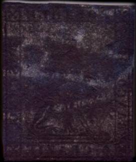
Let us go now to the paper, other "pain" for the lovers of these stamps.
It is of hand made type, of relative good quality, of variable thickness. It
was colored with a blue shade (someone says with a bath in water, others that
it was colored in paste), but it did not maintain constant this coloration in
the following printing runs. We can find it both in blue shade and in gray shade
going through many intermediate shades, not always easy to classify. The paper
was with watermark for security. It was used paper already available, making
some modification to the watermark by the paper mill Cini from S. Marcello Pistoiese.
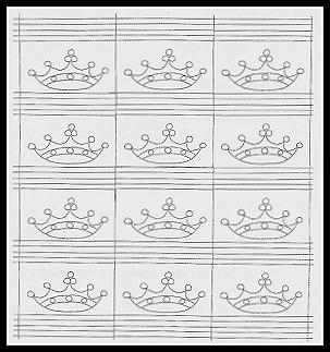
It is put in the paper in very heavy way and sometimes even cuts the paper.
It is formed by 4 lines of 3 crowns separated by 5 horizontal lines and by one
vertical (Fig. 3 - 4).
 |
 |
|
Fig.
3: the "Crown" watermark as it
presents itself in the sheet and in the stamp.
(the photo of the sheet is taken from the article here below mentioned) |
|
For the ones who want to go deeper in the subject of the printing of these stamps,
I have found a beautiful article, very detailed (from whim I extracted part
of the info) appeared in the Vaccari Magazine, nr. 24 of November 2000 by Ferruccio
Lucini and Luigi Sirotti. I invite you to go also to the "Bibliography"
section for the list of other important works.
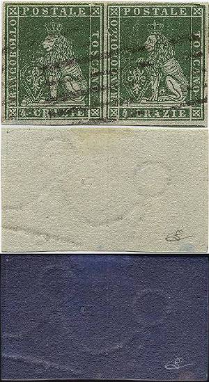
The stamps of the issue did not get prepared and issued all together, but according
to this "official calendar": the real date of use known are
in some cases after those official of the issue and are mentioned in the single
cards of the stamps.
Of each value there are printing runs made in blue paper or in gray paper or
in intermediate shades: only the 2 Soldi was printed uniquely in blue paper
and the 60 Crazie is only in gray paper:
| 1 Quattrino | Black |
September
1st, 1852
|
|
1 Soldo
|
Yellow
|
April
1st, 1851
|
|
2 Soldi
|
Scarlet
|
April
1st, 1851
|
|
1 Crazia
|
Carmine
|
July
1st, 1851
|
|
2 Crazie
|
Blue
|
April
1st, 1851
|
|
4 Crazie
|
Green
|
April
1st, 1851
|
|
6 Crazie
|
Indigo
|
April
1st, 1851
|
| 9 Crazie | Violet brown |
July
1st, 1851
|
| 60 Crazie | Deep scarlet |
November
1st, 1851
|
To be outlined how
the 60 Crazie value, of quite high face value, was seldom used: it's quite
rare.
We don't know the quantities printed. As already mentioned the paper used
presents itself in the two colors blue and gray and in a lot of intermediate
shades; in addition, the stamps had inks not constant and can be found in
color quite different and with inking more or less abundant, that sometimes
may cover part of the drawing and of the labels. In the presentation of the
single value cards I will present only a typical sample, to avoid creating
confusion. In addition I'll try to choose the samples in the way that it will
be possible to see the stamps, even if some margin may results a bit "touched",
instead of parts with big margins but with too "covering" cancellations.
If someone has new samples of best looking or used better than the ones here
presented can contact me and I will be happy to use them!
Between the varieties several stereotypes bumps should be mentioned. They
are due their wear or retouches during the printing or to poor attention during
the substitution of ruined pieces (some too much hammer hitting left perennial
signs..... See "Going Deep" section). We can also find rare
samples without watermark (on the basis of the disposition of the lines and
crowns net it could happen that same piece went in a zone of the sheet without
watermark).
We are aware of printing essays of some values, printed on white paper without
watermark and also on paper already printed with other stamps as well as taken
from books! There are also essays printed in black on white paper or colored
always without watermark.
They were valid up to December 31st 1859 (with the exception of the 2 Soldi
that was put out of validity October 20th 1852).